In my last post I mentioned my first attempt at a chart for this. My second attempt is below
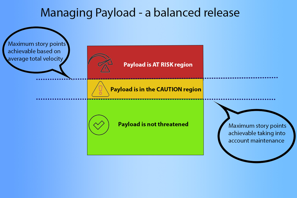
This approach has three regions –
i) Green – where the entire payload is not at threat
ii) Amber – where some of the payload may be at risk
iii) Red – where the payload is definitely at risk
The idea is that teams can do this calculation based on their payload and velocity. The lower dotted line is their average velocity taking into account maintenance and the upper dotted line is their average total velocity. The aim is to ensure that the MUST HAVE payload for the release sits comfortably within the Green region. It’s ok to have additional payload in the Amber region but none of this should be MUST HAVE. If any of the payload is in the Red region it means that even if the team drops everything then this is at risk.
Teams can do this calculation as often as needed, when planning a release and regularly afterwards. If some of the payload is in the Amber region then this can be the trigger to start discussions with the Product Owner – if we need to reduce our maintenance overhead for a few iterations in order to maximise the effort on the payload would this be possible?
So this is an improvement on the earlier chart as we have a clear RAG indication based on how the payload can be expected to be delivered based on the average velocity for teams and their expected maintenance overhead. But perhaps we now need to think more about this maintenance overhead, particularly when viewing this as a “balanced” release – I’ll write about this in my next post.
